Realigning a packaging design system
Case Study #1
Kitsch had contracted with an outside branding agency to update their then ten-year old brand with a fresh and contemporary look. The agency built an elegant base-12 grid system that created a refined and cohesive system, elevating the brand look. The new system worked well with the accessories line, but became far too rigid to account for the more fluid needs of an ingredient-driven, mass market personal care product line.
Challenge & Solution
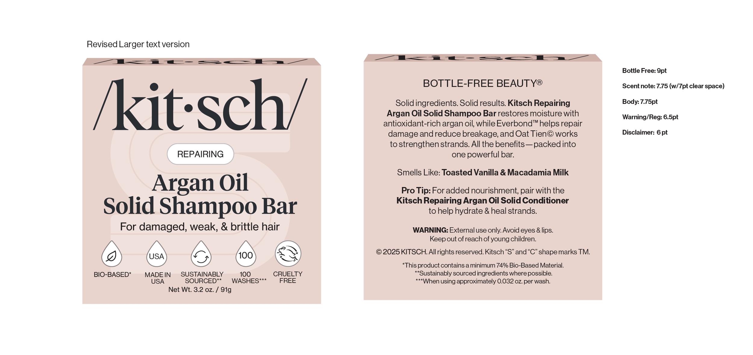
The new branding had already entered the market so we needed a solution that would fit with the items currently on shelves but still account for the changing needs of an ingredient-driven line of products. I devised a simplified zonal mapping system overlay on the original base 12 grid that allowed for items to expand for space where needed while providing a seamless transition along the multiple product lines. The result was a cleaner, simpler front and rear panel system that can accommodate multiple languages, and a fluctuating volume of text and icons.
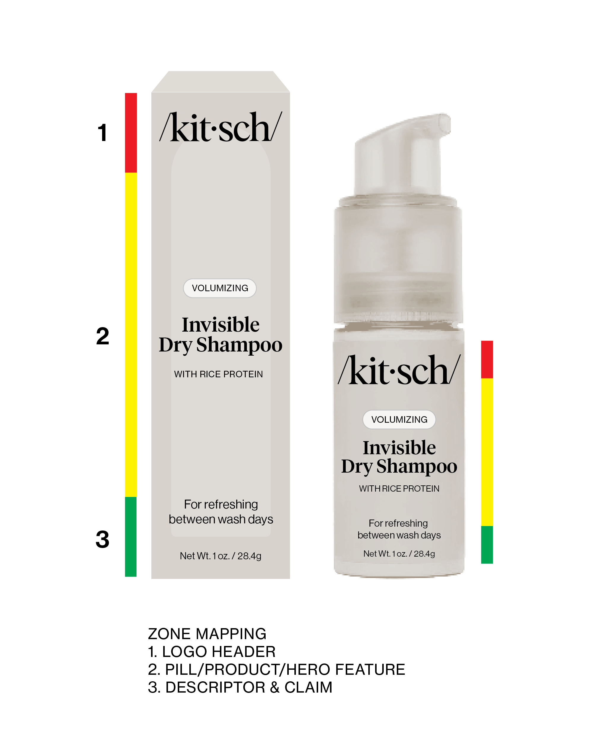
Zonal System Diagrams:
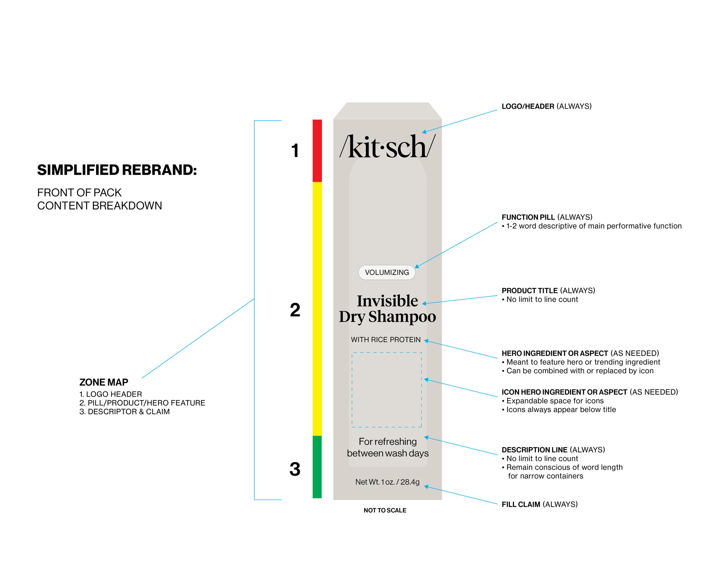
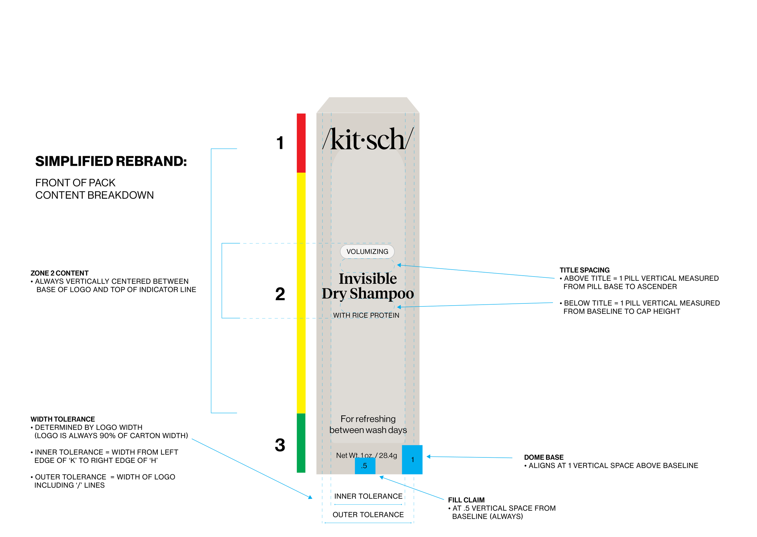
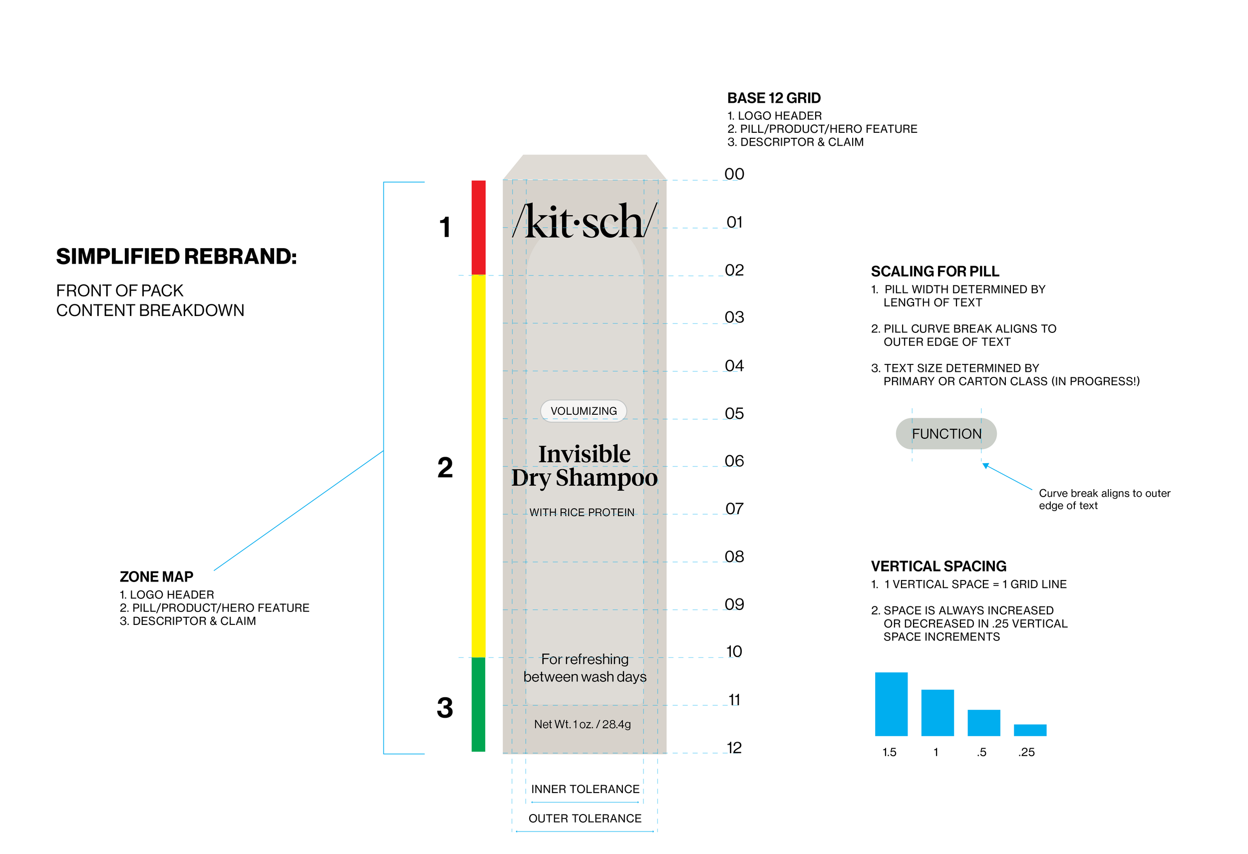
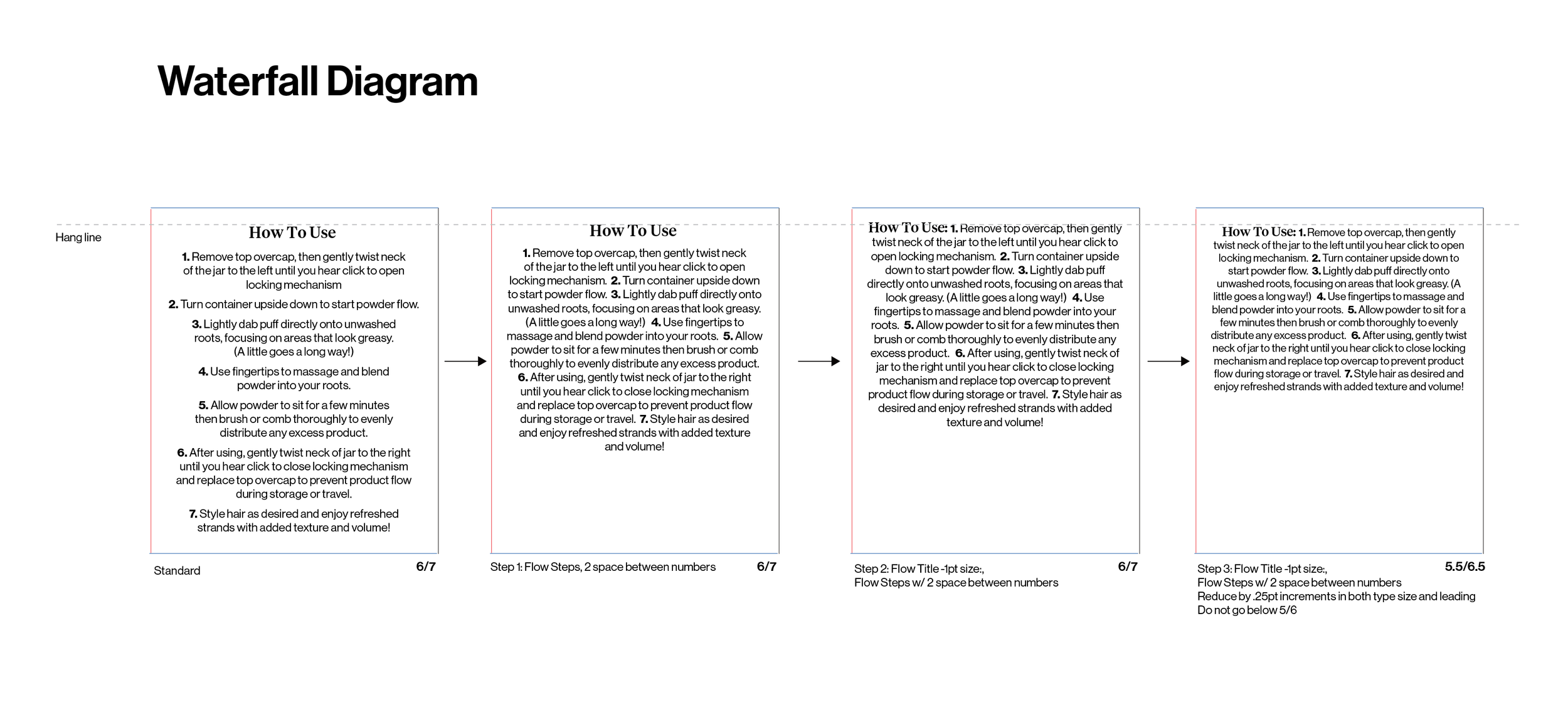
Text Waterfall Diagrams:
Results:


