Connecting a brand system
Case Study #2
The Lip Smacker brand beautifully complex—spanning multiple audience age ranges, legacy staples, innovative new releases, multiple seasonal campaigns, and licensed products—it’s hard to pin it down under one cohesive brand
Challenge & Solution
Because of so many moving parts, the brand did not have an official style guide, and given the lightning pace of mass market, no guide was ever developed. Bringing the legacy brand into a tight standardized visual system would diminish the fun and joyfulness its known for. Instead of forcing everything into a tight box, I focused on a number of visual positioning touch-points:
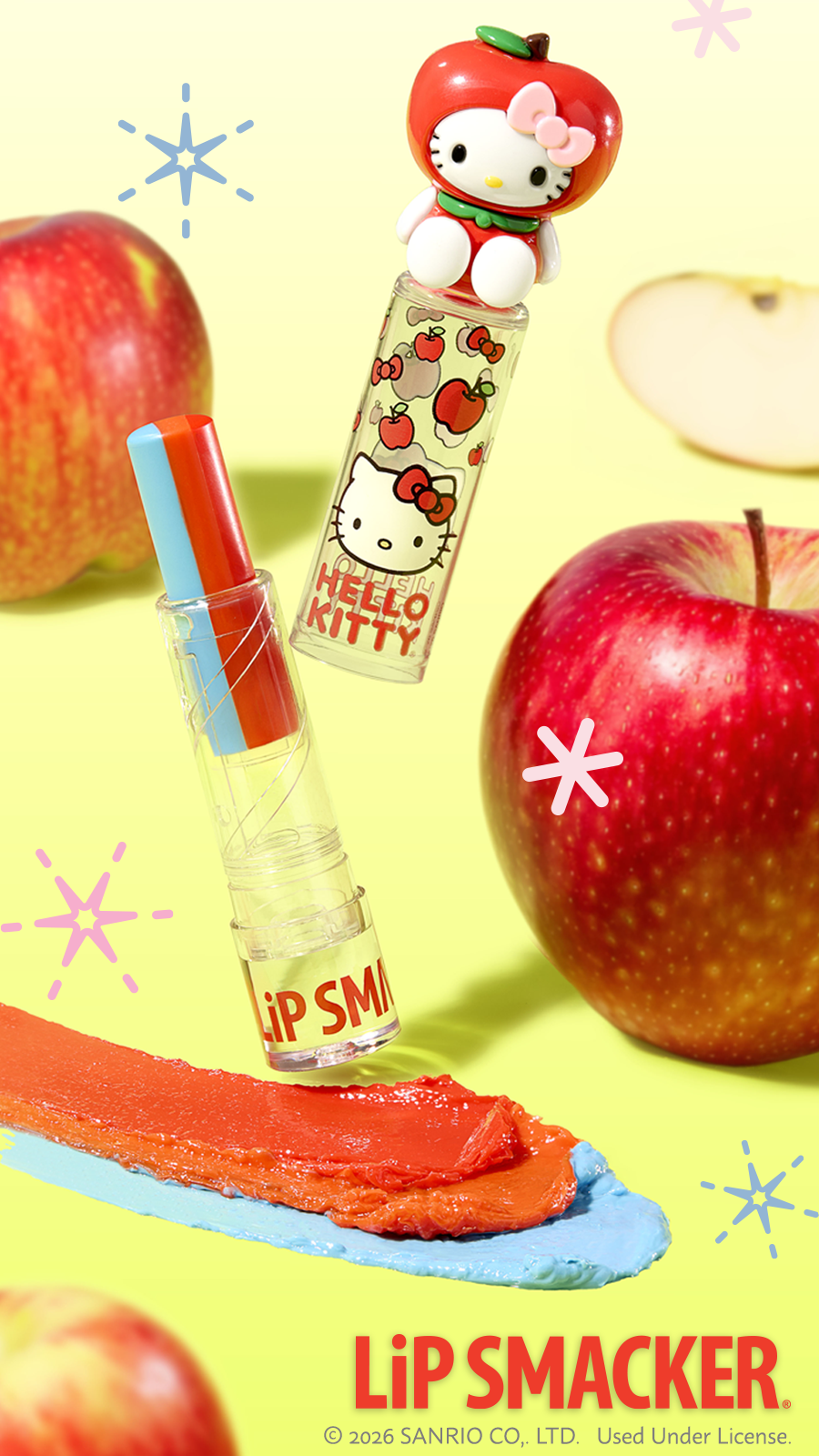
Determined a grounding element with the consistent positioning of the logo on all primary and secondary packaging
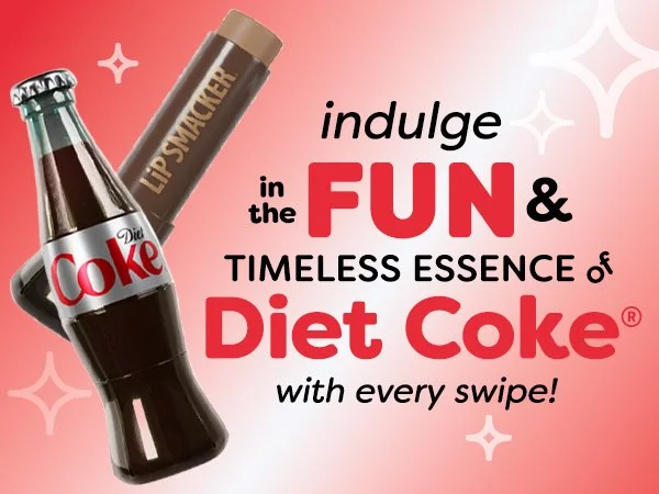
Developed a decorative icon set, known as ‘glitz’, to create a fluid design element that lends familiarity.
Pushed emphasis onto the ‘best flavor forever’ tagline as a line of continuity. The tagline becomes an illustrated element that adapts to the seasonal campaigns.
A yearly visual refresh. Logo, tagline and glitz remains consistent while the colors and visuals update with each year.

Lip Smacker GLITZ icon set:

Sparkles

Starbursts

Dots

Burst Emanata

Illustrative Tagline
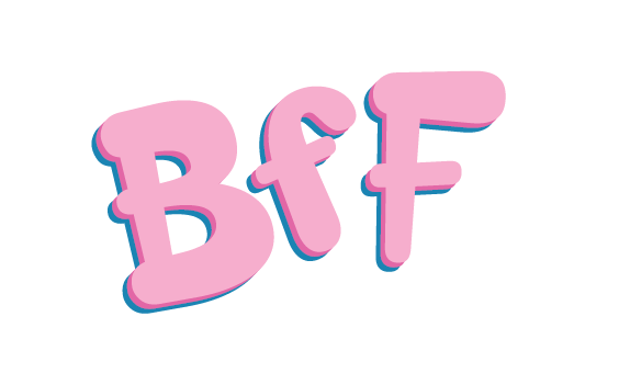
Illustrative BFF
Results: